My team has been exploring how to make data more accessible and how can we make research more central to how people make their day to day decisions. This article in the Guardian on obesity is brilliant showing the power of visuals to reveal how we are physically changing over time and the rising obesity epidemic. See the visually changing map from 1975 to present day below. And this is connected to climate change and health, by designing cities built around cars, we reduce our opoortunities for walking. And to see the health benefits of walking, watch 23 and 1/2 hours. It all starts with the first step.
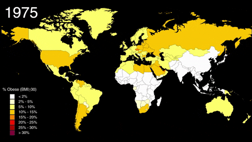
"Watch How Fast the World Became Obese" map, via Metrocosm
Topic
- Log in to post comments


CRC Comments