By: Jaime Clifton, Research Curator
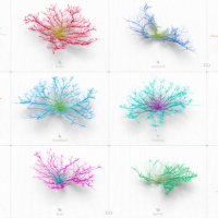
Data visualizations, including interactive maps and GIFs have taken the web by storm. In the last couple of months, we saw Ed Hawkins’ spiral climate GIF go viral inspiring another set of GIFs animating the world’s depleting carbon budget. And just last week, an animated map illustrating the migration patterns of animals caused by climate change inspired numerous digital articles and tweets. So why are data visualizations working so well? Is visual communication the answer to wide research dissemination? Tristan Smith, one of the creators of a the ship map illustrating the movement of the world’s commercial shipping fleet in 2012, shares his insight in an interesting interview with Co.Exist. He suggests that data visualizations enable viewers to access information through a different lens and that this innovative mode of communication can offer new insight by revealing patterns or information that may otherwise be missed. They also make information more accessible and engaging to the public through eye catching visuals. Perhaps the reason for their success is their ability to effectively intersect art, science, and technology? Much like museum exhibitions, they offer multiple entry points for viewers. Do you remember the Ideas, People, Objects interpretive framework I discussed in a previous post? It sure seems to work!
Check out my colleague’s insightful article investigating data visualizations.
- Log in to post comments


CRC Comments